Friday, May 4, 2012

Colour Me Happy

I have been working with a friend, Denise, on her upcoming kitchen reno/redesign. It is going to be STUNNING! We have spent the last few weeks selecting cabinet profiles, backsplash (swoon!), counter tops, etc...The overall style we are going for is "transitional" - many contemporary features (sleek Caesarstone counter tops, chrome pendants and hardware), mixed with some traditional elements (crown molding, shaker cabinets). Now for the backsplash - it falls beautifully into both categories - traditional because it is an Italian Calacutta marble, and contemporary, because it is in a random brick pattern.

Another important consideration is the overall mood or feeling that we'd like the space to convey. Denise says, "happy, inviting, and fresh." This is where I see pulling in some fabulous colours and geometric patterns in her window treatments and chair cushions, and in the accent pieces we select. An easy place to start the selection process is by looking at fabric swatches.

Here is colour palette A:


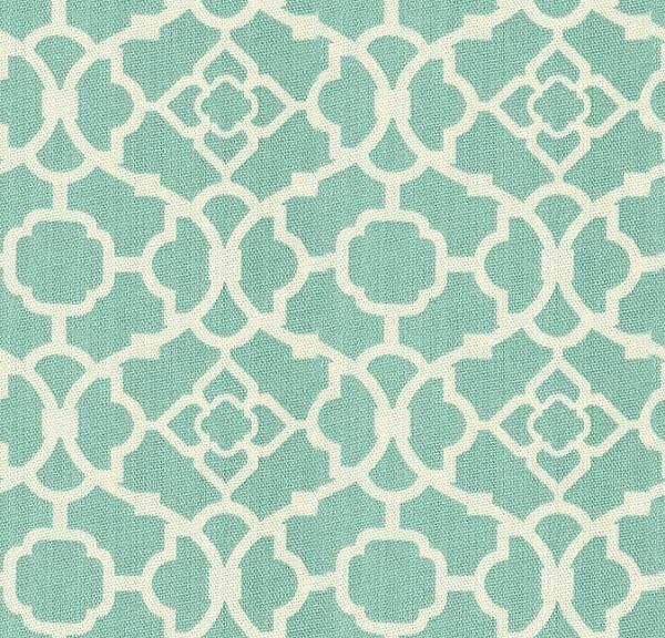
And here is Colour Palette B:


All of the fabric swatches from both option A and from option B can be found at: Tonic Living


Denise and I see the virtues of both palettes and have some tough decision making to do! Which palette do you like better? Perhaps you will have more of an opinion once you view many of the components for the new kitchen all laid out together. Here is the inspiration board for Denise's kitchen:


This inspiration board was created using Oliobaord. 

So, what do you think? Does it appear "happy, inviting, and fresh?" Is it a "transitional" blend of both contemporary and traditional elements?

Stay tuned over the next while where I will be updating you with pictures of this exciting reno - start to finish!

Have a great weekend, everyone!
Kerry


Wednesday, May 2, 2012

Smitten

Hello!
Have I mentioned before that I LOVE fabric? I mean, it is a bit of an addiction. I think I may have a problem. I seem to collect fabric swatches like my son collects comic books. Back when I was an avid quilter, it wasn't really an issue. Now that I am doing design work, it is also not an issue (hooray!). However, the several year gap in between? Well, maybe we better not talk about that...

So, what's not to love? Fabric adds instant texture and depth; it has the ability to unify an entire space; it is a fabulous way to add little "pops" of colour to an otherwise neutral palette; it comes in an endless array of colours, patterns, and textures. And, regardless of style, preference, or aesthetic, there is a fabric out there for everyone! This season, I am especially in love with anything in a trellis pattern. Here are just a few of the swatches that have caught my eye recently:


Waverly

Yum, right? Isn't there something here for every palette, style, and budget? And, what is also interesting to note, is that it is not just textile designers who have been bitten by the "trellis bug." Here are some of my favourite applications of this "traditional with a contemporary twist" pattern: 

I love this shade of Kelly Green! Classic. 

This pattern provides a great contrast against the horizontal tongue and groove paneling. 
Via


Wow! I love the idea of wallpapering the back of a bookcase or armoire! 
Via


This just makes me happy. 
Via


A more traditional setting, yet equally fabulous. 
Via


I wish my home office looked like this! 
 Via


Gorgeous! 

I hope everyone has a great evening. 
Kerry 


Monday, April 30, 2012

The Dynamic Duo

My two favourite colours, bar none, are blue and green. Without exception. People who have seen my home will not be surprised. Frankly, even if you have seen only my blog header, the above statement may be just cause for an eye roll. "Really, you say? I had no idea!" Now, while I am partial to nearly every shade of both - everything from pale sky to navy, and from celadon to emerald, my absolute favourites are the pale, watery colours that can be found in nature - in beach glass, in hostas and hydrangeas, and, even on the eggs hatched by Martha Stewart's Araucana chickens! Aren't they cool? Not that I really have any interest in raising chickens, but if I ever did, I would want a few of these!


1


And, not only do I love this classic pairing, it would seem that many others do as well:


 2


3


4


 5


6

Have a great evening!
Kerry

Saturday, April 28, 2012

Inspiration

Yesterday, I shared an inspiration photo for my friend's built-in cabinetry. With that big decision out of the way, we focused on the MANY others that needed to be made...and quickly! Construction was set to begin before we knew it.

We picked this gorgeous Kentwood North American Red Oak hardwood for the flooring:


Next came the fabric selections (for drapes, accent pillows, and upholstery). This was SUCH a fun process and we both LOVED the end grouping. Here is the principal fabric (used on inverted pleat drapery panels and on one 20 x 20 " accent pillow):


Isn't it fantastic??? It has all of the colours that we were hoping to pull into the room and it has the most interesting texture (like a heavy linen with lots of "slub.") It is from Tonic Living.

For paint, we tried out at least a dozen colours on the wall, as well as on pieces of cardboard. Finally, we found a deliciously rich hue that has lots of depth, warmth, and character (although there is something to be said about the name - "Drab" by Farrow & Ball).
And then for all of the millwork in the room (crown, wainscoting, window casings, baseboards, and even the ceiling) we picked Benjamin Moore's OC-33 "Opaline" which is a tried and true colour for me  - it is such a beautiful shade of creamy white (and, as an added bonus, the finish on the built-in cabinetry is almost a perfect match! We did well - it looks great!


And here is an "all put together" look that I created using Olioboard.


So, obviously individual items are not to scale, but this "mood board" certainly does give you the overall "feeling" of what the space will look like upon completion, right?

Well, the room is almost complete - two 2' x 2' fixed picture windows with an interior leaded glass grill in a traditional diamond pattern still need to be installed, but is pretty much it. I will have reveal photos to share with you very shortly - wait until you see - it is sooo gorgeous!!!

Until next time,
Kerry


Friday, April 27, 2012

Decisions, Decisions

A few months ago, a good friend of mine (also named Carrie) called to tell me that she was looking to redesign/redecorate her sunken family room and would I help? Now you have to understand, I was still a new student at that time and had never tackled a project that big (other than in my own home) or that detailed before. After my initial hesitation was over (based on a very REAL feeling of unreadiness), I jumped in with two feet and haven't looked back since. I have learned so much, and it has been a very rewarding project - not to mention fun!

At the top of Carrie's wish list (understandable given the fact that she has THREE teenage boys) was storage (for media equipment, games, books, etc.) I wanted to get a feel for the look she was after, so I showed her the following pictures of built-in cabinetry:


We thought this one was interesting, especially given that the back of the shelving has been painted in a darker colour. Hmmm...1


This one was also cool - ample storage, but maybe a little too contemporary for her overall aesthetic? 2


This one boasts clean, simple lines and minimal detail. Lovely, but again, a little too modern. 3


Wow! What a gorgeous space! We loved many elements of this design - we can feel that a decision is right around the corner. 4


And, finally, we have a winner! This image "spoke" to both of us and we put the design plan in motion. 5  


We loved the clean lines, the flat shaker profile on the cabinets, the antique bronze hardware, and just the warmth - doesn't it look inviting? I would love to pick a book from one of those shelves and curl up in a cozy chair beside it to read.

I will be back soon to share further details with you about this project.

Have a great weekend!


Thursday, April 26, 2012

Have you heard?

of Olioboard? It is an amazing site that I discovered a few months back - it lets you create your own "mood" or "inspiration" boards using easy-to-navigate tools and it gives you access to a huge bank of images (150,000+). What's more, there is an clipper tool that you can install in your browser bar (similar to Pinterest) which means you can search and save an unlimited number of images. There is a built-in budget tool, a source guide, a Benjamin Moore colour palette tool, and I haven't even told you the best part yet - it is FREE!!! The Pro Plan ($9.95/month) has some additional features to offer, but the basic building tools are only a click away.

I have been having a lot of fun creating these boards and have found that my clients LOVE them. Now, while nothing can replace the touch and feel experience of an actual inspiration board, this one is quick to produce, can easily be edited if a client wants changes, and it can be emailed and even posted on facebook. By now you may be wondering if this is an Olioboard sponsored post, and the answer would be no! I just really love this site and I urge you to try it. If I can navigate it, then so can you!

As one of my recent assignments for school, I had to hypothetically redesign one of the rooms in my home - I chose my master ensuite because it is in SUCH need of a makeover! So, after writing down all of the things I would change about the room and why, I shared my inspiration for what I'd love the room to look like...one day...a girl can dream...can't she?

Here is what I came up with:

Super fun! And just as soon as the money tree in my backyard decides to bloom again, I can turn this dream into a reality.

Kerry

Wednesday, April 25, 2012

Teal is Tried and True

It is no secret that I LOVE the colour teal - in fact, my grade 12 prom dress was a ridiculous crinolined teal number with dyed shoes to match - and I loved it! Fairly safe to say, this deep and opulent colour fell out of fashion for a while - I am sure that my ensemble didn't help matters any - but recent sightings have deemed it once again worthy of a front and center place in our wardrobes and in our homes.

Also referred to as blue-green, dark aquamarine, cyan, and even peacock, this complex colour is as versatile as it is bold - and it seems to complement so many other colours! Here are some of my favourite uses:
I love this tufted "City Chic" sofa by Old Hickory Tannery and it can be found here at Horchow.


Check out this great space - the future palette of my office??? Yum! I love the grouping of vases on the top shelf, and, how cute is that lattice patterned stool? I found this inspiration on Pinterest.


This is more of a traditional fabric, but it would look stunning in a slightly formal dining room, either on upholstered chair pads or on drapery panels. This fabric is from Tonic Living right here in Toronto.


And I don't even have to look back at photos of that 1989 prom dress, I KNOW that this dress from Ruche is MUCH more chic!


And teal grasscloth wallpaper? Are you kidding me? LOVE! I love grasscloth in ANY colour, but in teal? Fabulous!


What I love the most about the above picture is how the majority of the room reads more or less "neutral." Yet, adding in some subtle teal accents  is enough to take this room from good to GREAT!


And finally, teal glass backsplash tiles - how gorgeous are these? Shiny and reflective, just like a deep swimming pool.


Oops - I lied. I couldn't quite stop there. Here is a wallpaper that I absolutely adore from York Wallcoverings. Oh, how I would love to wallpaper my dining room in this paper!

Do you share my affinity for this colour? If so, tell me what you love!
Have a great evening!
Kerry