Wednesday, September 24, 2014

Fab Five!

hi,

I've been seeing so many beautiful, fun, and interesting things this week that I just had to share a few of my very favourites (I could have shared one hundred!)


100% Mongolian cashmere infinity scarf - designed in Toronto
and ethically made in Mongolia. From Cloud Cashmere. 


Woven in Sweden from 100% New Zealand lamb's wool, these
throws look so cozy! From Terrain. 


I am obsessed with art prints from The Rifle Paper Co. This palette and
theme is perfect for the season. 


SWOON! I love these black leather booties from Kate Spade. 


Round ottomans are everywhere right now! Their pleasing lines really soften a space and work as additional seating OR as a surface for serving drinks!!! This Ikat beauty is from One King's Lane.


Well, there you have it. My fab five for the first week of Autumn. What's caught your eye recently? Post a comment on the blog - I'd love to know!!! 

xo Kerry 


Tuesday, September 2, 2014

bubbles and blush!


(or, in other words, champagne gold and pale pink) 

Long before I was a "blue" girl, I was a "pink" girl. If asked my favourite colour, I would instantly answer "pink." To this day, Sarah Bernhardt peonies are my favourite flower, and given a rainbow of options to choose from at the bakery, I always choose the pink macaron. 


Recently, I began thinking about a colour palette for my home office (currently just a desk in my unfinished basement - but an upcoming reno will see it transform into a space I can call my own). As I was searching through images on Etsy (a favourite pastime, I must confess), I found this pretty art print and fell in love with this girly and glamorous, yet uniquely understated colour combination. 

Yes, I am talking about pink and gold. 


And, the more I looked, the more I was convinced that this dynamic duo had lots to offer the world. 

Whether as pretty nail art, 


Or as a delicious looking dessert.


I love the feminine qualities of this pairing, as well as their subtlety. Youthful and restful, they look adorable in a nursery,


or as the pleasing palette at a bridal or baby shower.


And then we enter the vast world of interior decorating and design. A place with limitless possibilities for colour combinations - and I love so many of them!!! But again, I keep coming back to this pairing.

So in love with these toss cushions that I found on Pinterest!!!

Is it the sophistication I am after? The femininity (after all, I am the only female in my house)? Or is it possible that, being a very practical person (and being married to an even more practical man), I like the idea of having a slightly indulgent, different-than-anything-I've-ever-had-before kind of room?

If you know me and have the answer the the above question, please feel free to fill me in!!! :)

Here are some other decor images featuring my latest fav combo: 


Do you know what is EXTRA fabulous about this pretty image? The pictured shelves
 are courtesy of an IKEA hack! Just amazing what can be done with a can of spray paint. 

I love the Art Deco vibe in this image - especially the geometric wallpaper.

Today must be the day for featuring IKEA hacks - this trestle desk has had
gold leaf added to amp up the wow factor!

OOH! Lovely display here of framed art prints (can't get enough), apothecary jars, and other assorted treasures. 


So, there's my favourite colour combination (of the moment!) - it really does change all the time. And, while I don't know that I'll commit to this palette for my home office, I may just try out the pretty manicure pictured above.

Have a great day everyone!

Kerry xo


Friday, August 22, 2014

a HIS and HERS bath


Yes, it IS possible to design a space that meets the needs and wants of BOTH sexes. 

I must admit to being a bit skeptical when I initially met with this charming couple. He, a practical and skilled contractor with an eye for clean lines and purposeful finishes. She, a warm and gracious person looking for elegance and a touch of glamour. Hmmm...

Here's what I did to ensure that both parties were satisfied with the end result: 
  • dark wood custom cabinetry by Kitchen Pro for HIM 
  • warm gold accents - including the stunning Clarendon mirror from Crate and Barrel for HER 
  • contemporary chrome fixtures from Grohe and Union Lighting for HIM 
  • soft and "pretty" elements (floral roman blind, basket of towels, designer bath products) for HER 


Chrome fixtures were softened with the addition of warm gold accents (mirror,
tiered side table, picture frame)


A spacious shower, complete with marble niche and bench, by Chaplin Home Improvements


To lighten the look of the dark cabinetry, we added glass knobs from Anthropologie  and a
beautiful white Quartz countertop (through Delsur Marble)


Calacatta marble tile in a beautiful hexagon pattern (through Ontario Tile)


Chrome faucet (and coordinating shower fixtures) from Grohe


Geometric area rug from Dash and Albert. Their rugs make me happy! 


The Clarendon mirror from Crate and Barrel reminds me of a sea urchin and
creates a stunning focal point in this space


Fabric for the sweet roman blind through Tonic Living and
sewing by the talented Lisa Sinclair 


The home owner calls these the "no-no" towels (in other words, look, but don't touch!) 


I found this photo on Shutterstock and love how it mimics the "spiny" shape
of both the mirror and the floral print found in the roman blind


An apothecary jar filled with simple bars of Ivory soap makes for a pretty display 


Bath products from Tuliptree and Saga 


I would like to thank Sarah Leeman of Bean Shoots Photography for capturing this space so well, the guys at Chaplin Home Improvements for their hard work and expertise in implementing the design, and to the lovely homeowners for putting their trust in me to work on this project with them.

Have a great weekend,

Kerry


Friday, July 11, 2014

ooh la la!


Happy Friday! 

I recently had the pleasure of working with a sweet friend who wanted to add some glamour and a pinch of fun to her spare room (aka the "no boys allowed" room!). 

With one wall already wallpapered in a pretty black and white damask, we painted the remaining walls this sophisticated silvery grey - Benjamin Moore 2125-60 - "Marilyn's Dress"


Next, we added a pretty roman blind in a grey faux silk. Thanks to Lisa Sinclair Sewing for the gorgeous (as always!) finished product. 


Gorgeous knobs from Anthropologie (unfortunately, they don't seem to be available any more - but, don't despair, they have loads of other beauties) were added to dress up a simple white lacquered parsons desk.


Jenn picked up an adorable aqua chest and a canvas "Marilyn" print from HomeSense. I love it when my client's have such a keen eye for design! Great job, Jenn!


Here, a full-length mirror (essential in any dressing room) reflects a entire wall of IKEA cabinetry - I would die and go to heaven if I had that much clothing storage in my home!


And, finally, I wanted to add something unique and custom to Jenn's space. I asked my graphic designer friend, the talented Joelle Segal at InBloom Studio, to use fashion quotes to create some art card prints that would coordinate with the theme and colour palette of the space. She did a fabulous job! And, while mirrored frames never photograph very well, you can at least get an idea of how this mini gallery wall turned out.


Here are the fashion quotes that we used on the gallery wall: 

"Over the years, I have learned that what is important in a dress is the woman who is wearing it." 
- Yves St. Laurent 

"Playing dress up begins at age 5, and never truly ends." 
- Kate Spade 

"Give a girl the right shoes and she can conquer the world." 
- Marilyn Monroe 


Have a wonderful weekend!

Kerry


Monday, June 23, 2014

FROM PRE-LOVED, TO PRETTY LOVELY!

Hi,

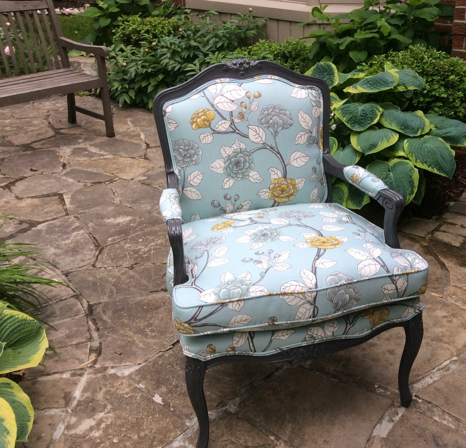
Things have been super busy around here the last little while (and not over yet!), but I wanted to share these photos with you of a COMPLETE re-invention of a time-worn Bergere chair.

I have to give my sweet client a huge shout out for seeing the potential in this forlorn and forgotten piece of furniture! Her keen eye picked it out for a steal from the neighbourhood Salvation Army and knew that, with a little TLC, this chair could regain its original beauty and charm. 

But, never did we think it could also look so CHIC!!! 


Here is the sad and woebegone BEFORE shot: 


One should also note, that the existing fabric (not only stained and worn), had a plastic texture - almost like the flannel-backed vinyl used to cover picnic tables. It was, quite frankly, really gross. 


And here is the much-improved, seriously GORGEOUS "new" version: 


The wood was custom painted in Kendall Charcoal by Benjamin Moore, and the custom upholstery is Leda - Peony by Dwell Studio from Tonic Living. Isn't it lovely??? 

xo Kerry 


Monday, April 28, 2014

six things i'm loving right now...

Hi, 

Happy Spring!!! 

It has been awhile. Things have been busy around here, and, as usual, the first thing to get neglected is my poor, little blog. Better that, than my children, I suppose! 

As usual, there has been no shortage of inspiring images, pretty new products, informative blogs, and stunning shop windows to capture my attention over the last few weeks. People are so creative, and so, so talented! 

Here are just a few of the products/fresh ideas/trends that I am crushing on this season: 


Terrariums are not exactly a "new" trend, but one that seems to keep growing in 
popularity as more and more people recognize the health benefits of houseplants. I seriously need to get over my phobia - an infestation of spider mites on an English Ivy YEARS AGO has kept my home a relatively "houseplant free" zone ever since - but I think that I am ready to try again. Wish me luck! 


{2} 

The new Sarah Richardson for Kravet line of fabrics is classic and elegant, 
yet relaxed and inviting, at the same time. So very pretty! 


Round penny tiles have come full circle! LOL. Originating back in the early 1900's, 
"penny rounds" (as they are also called) are popping up everywhere - in a multitude 
of applications, materials, and even colours. 


{4}

Aahh...the cozy outdoor space has always held a strong appeal in the hearts of
many - and I think it is looking extra good after the winter we just had!


{5}

The colour coral is HOT, HOT, HOT this season! I'm seeing it paired
with its traditional partner, gray, as well as with lots of turquoise, crisp white,
and even a buttery yellow!


{6}

My interest in original watercolour prints has been consistently growing over the
last couple of years. I love this Etsy artist's work using her favourite local plant life as subjects.


Wow! Six things already? And none of them even include items of food or beverages! LOL.

What things have captured your interest lately? Any "must-have" items on your wish list? I'd love to hear from you, so please feel free to post a comment.

Nite!

Kerry xo


Monday, March 17, 2014

spring GREEN with envy!!!

hi,

I think I can safely speak for all of us Canadians (and anyone else who is currently experiencing the ongoing effects of a polar vortex), when I say that WE ARE SICK AND TIRED OF WINTER!!!

In an attempt to "will" spring to arrive, I keep finding myself drawn to this beautiful shade of green.


I would like to be invited to a party featuring a spring green candy bar! 


And I would LOVE to receive a bouquet of these gorgeous spring green flowers (not even sure what these are - they look like a cross between a ranunculus and a straw flower - but I sure do love them!) 


This image grabbed me because of the sharp contrasts of both colour and material on the 
one hand, and the repetition of both form and texture on the other. 
And, again, it just says "spring is here!" 


This image says "English cottage" to me with its vintage botanical prints and the shabby chic decor. I love the more subdued wall colour (like a ripe, juicy pear) when paired with the 
more intense "Kelly green" of the cushions and foliage. 


Now I realize that this dresser is painted a little more "citron green" than true "spring green," but seriously? How stunning is this piece? I love everything about this image - from the damask wallpaper, to the grouping of cloches, and everything in between. 


Fingers crossed that all of this GREEN inspiration has somehow kicked the last of 
winter in the pants and put spring in motion! 


IMAGE SOURCES
1, 2 , 3, 4, 5

Until next time, 

Kerry xo