
I came across this gorgeous colour palette the other day and I just had to share it with you. One of my favourite stores, West Elm, has paired with Sherwin-Williams to create this stunning grouping of colours for Fall 2013. At first I was a little surprised - it felt like a couple of the "expected" fall colours were absent (where are you mustard-yellow and burnt orange?) - but, the more I looked at it, the more I liked what I saw and began envisioning multiple uses and interesting pairings of these paint colours.

And then do you know what happened? I started seeing these colours (in particular the rich red and the teal blue) EVERYWHERE!!!
Check out some of these super pretty images:


Whoever styled these shots did an amazing job!!! I love the pattern play, the rich textures of the textiles, and the bright pops of colour against a neutral off-white background.
What about these images caught your eye? And even though this isn't a "traditional" fall palette, do you like it, nevertheless?
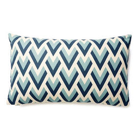
Inspired by these images, I looked through one of my favourite shopping sites and found some great coordinating pieces.
Here are just a few of the items that I found:


Well done West Elm and Sherwin-Williams! I love the colours you selected for fall 2013, and, I look forward to seeing them everywhere this season.
Until next time,
Kerry