Tuesday, January 28, 2014

Pantone 2014 colour of the year - RADIANT ORCHID

hi,

On this absolutely FREEZING cold day, I wanted to share some images of a colour that reminds me of spring. Pantone recently named "Radiant Orchid" the 2014 colour of the year. They feel that it "blooms with a confidence and magical warmth that intrigues the eye and sparks the imagination. It is a colour that emanates great joy, love, and health."


1

Now, while I am not typically a huge fan of purple, a couple of my good friends are, and, at this dreary time of the year, ANY colour that stirs up thoughts of fresh cut flowers, open-toed shoes, or even Easter jelly beans, is DEFINITELY a good thing.

Here are some images of this pretty purple that caught my eye: 


This bright and airy space is delightfully feminine. 
2


I love the neutrality of this space - and then, a hint of the unexpected - a bright pop of colour in a gorgeous abstract piece on the wall. There are great contrasting textures in this room! 
3


What a pretty palette! It makes me want to put an orchid in every room of my home. 
4


I am just about to have a purple damask wallpaper installed on a client's living room wall. And while it is not as bold as this one, I think it is going to look amazing! 
5


Can't commit to such a bright hue on your wall? Not a problem - a vase of beautiful allium 
serves as a much safer alternative. 
6


Stay warm, my friends! 

Kerry 


Saturday, January 11, 2014

updated TRADITIONAL

Happy New Year!

I hope that everyone had a wonderful holiday season filled with family and friends.

I have been so excited to share some photos of a completed project with you! I LOVED every minute of this project - in no small part due to the lovely family I was working with. A sweet and gracious friend, her uber handy husband (all of the custom millwork was completed by him on evenings and weekends), and their two adorable daughters contributed to making this project a truly great experience.

Here are the items that were on the family's wish list: 
  • a light and airy living space 
  • suitable for entertaining, yet also conducive to curling up with a good book 
  • clean and linear 
  • updated, yet maintaining some traditional design elements
  • a neutral colour palette (specifically, "We're tired of taupe!") 

And here is what we came up with: 


The natural light in this room adds warmth to this already inviting space. 


Working with tonal fabrics allowed us to have some fun with pattern and texture. 


A "pop" of raspberry red adds a refreshing element to the space and draws the eye into the room. 


The side tables are by Bernhardt through Union Lighting


The table lamps are from Decorium, and decorative accents are from Indigo and West Elm


I love to add personal touches wherever possible, so in this space, I found and framed 
vintage maps of the family's countries of origin - Finland, Italy, 
England, and Canada. They are a great conversation piece. 


The gorgeous coffee table made from reclaimed wood with a cast iron base is from Pottery Barn


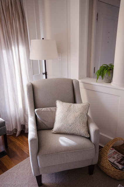
Floor lamps are from Pottery Barn and the cozy occasional chairs are from Decor-Rest


The great texture of this Samar Ottoman from Crate and Barrel can double as a side table or as a stool. 


Aahh...blue and grey. One of my favourite colour combinations. 


The stunning area rug is custom and available through APT carpets


Thanks again to my wonderful clients for letting me design this space for you! 

Stay warm and dry everyone! 

Kerry