Friday, November 29, 2013

Rielly's Retreat

Hi,

I have been SO excited to share some new photos of a completed project with you! I recently had the great privilege to work with a super sweet and fun teen, Rielly, to create a space all her own. I had so much fun working on this project!

At our first meeting, Rielly told me that her perfect room would be a combination of black, white, and Tiffany blue and would include the following details:

  • pretty drapes and LOTS of pillows 
  • a bench at the end of the bed 
  • a place to curl up and read 
  • photos of herself and her friends 
With the colour palette and those ideas in mind, I set to work sourcing a fun array of fabrics, furniture, and accessories. I also had a wonderful time creating some DIY items that really help to personalize her space. 

Here is what I came up with: 


In my opinion, EVERY girls' room should contain a chandelier. This one is from IKEA.  


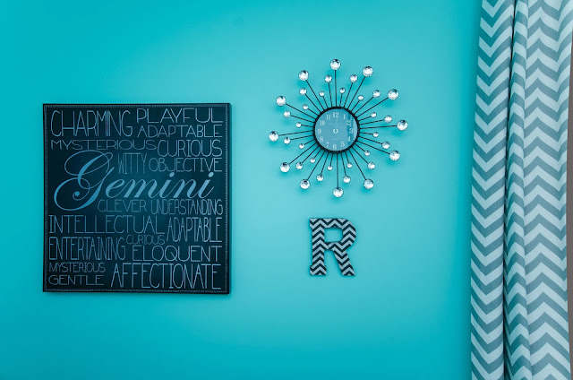
Just like every girls' room should contain a chandelier, it should also include a little bling. I fell in love with this sweet little clock from HomeSense with its rhinestone detail. 


Wall colour is custom, but is roughly based on the colour "Tropicana Cabana" by Benjamin Moore. The Gemini wall art is from HomeSense and the  letter "R" is from Michael's (I podged patterned paper on to it, let it dry, and then sanded the edges for a smooth finish). 


A super comfy, small scale, and cost-effective option for seating in a bedroom is the Ektorp Jenny Lund chair from IKEA. A cozy faux fur throw and a graphic print pillow complete Rielly's reading nook. 


This is a great overall shot that includes the striped rug from Crate and Barrel, and the custom upholstery (gorgeous headboard and bench) by Stefan at the House of Upholstery and Slipcovers


Close-up detail of the beautiful craftsmanship that went in to this headboard. 


This is by far my favourite shot of the room. I love the wide-angle, and I love how inviting Rielly's new bed looks with all of the custom cushions. The fabric is from Tonic Living and all of the beautiful sewing was done by Lisa Sinclair


To make this adorable flower, I roughly followed this set of DIY instructions. 


For continuity and flow throughout, I used the same velvet on both the headboard and the bench, repeated the nailhead trim detail, and used the grey and white
zig zag fabric as piping (also found on the drapes). 


Now, while I am sure the bench was intended to serve as a place to sit, or more realistically, to accumulate piles of clothes, (and not as a place to display colour-coordinated French macaroons), sometimes style trumps function (or at least until the photo shoot is over and we can eat the props!) 


The table lamps and side tables (tables custom sprayed in "jet black" by Benjamin Moore) are from HomeSense and the mug, coaster, and candle
are from Anthropologie.


DIY ribbon board - the large-scale damask fabric is from Tonic Living


The gorgeous jewellry "tree" is from West Elm and the glass jar and adhesive
rhinestone trim is from Michael's


For this DIY, I took a combination of Rielly's personal photographs, some downloaded photos of her celebrity "crushes," and then added in some inspirational quotes (found in the scrapbooking section at Michael's). Apparently, Channing Tatum is attractive whether you are 15 or over 40! 


Gallery wall of photos and quotes. 


Another DIY - I created this "tree of tags" using additional quotes that I matted on card stock and then hung from the branches of this cute little tree. It adds a pop of colour and some visual
 interest in the room. 


A close-up of the tag tree. 


The lacquered box and damask organizers are from HomeSense


So, that's Rielly's Retreat. What do you think? We had the opportunity to see Rielly's first reaction to her new space, and it was pretty great - I think she likes it!

Thank you so VERY much to Rielly and her family for giving me the chance to design her room, to Sarah Leeman of Bean Shoots Photography for capturing the true essence of this room, and to my fabulous design assistant, Denise Sharp, for all of her help.

Have a wonderful weekend everyone!

Kerry xo

Saturday, November 16, 2013

winter wreaths

hi,

I love wreaths. I always have, and I always will. I especially love natural winter wreaths - a daily reminder that, even though most plants are covered in a thick blanket of snow for several months of the year (I do live in Canada, after all!), spring will come again. They also seem to communicate a heartfelt, "WELCOME, please come in and stay a while"sentiment.

Have you ever noticed that wreaths can take on the personality of their "owner?" No, I am not one of those individuals who think other people look like their dogs, but I do think that one's holiday wreath can say an awful lot about a person.

If you think I am crazy, just take a look below.....


THE LINEAR, "TYPE A" PERSONALITY (just like me!!!)


CLASSICALLY ELEGANT. 


MERRY AND BRIGHT 
(this sentiment can also be used to describe an individual's personality - and I am grateful 
to know several women whose demeanour would fit the bill). 


THE COTTAGER 
(who apparently has a strong affinity for power tools!) 


THE "MARTHA" 


THE WINTER FORAGER 


THE TRADITIONALIST 


THE "SAVES HER YARN SCRAPS" KNITTER (also me!!!)


So, what will your holiday wreath/s look like this year?

Have a lovely weekend.

Kerry xo

Tuesday, October 22, 2013

luxe and lovely laundry room

hello,

For today's post, I wanted to share some images of a friend's laundry room that I had the good fortune to help design.

My client and friend, Tracy, wanted a light and fresh space that was both uplifting and relaxing. As this was one of my first "official" design projects, I must confess to feeling a bit of apprehension prior to beginning this task. However, once we began selecting the materials, choosing the refreshing palette, and incorporating some natural elements (Calacatta marble backsplash and a linen roman blind), my mind was put to rest and I couldn't wait to see the space come together.


Cabinetry is by Lumsden Custom Cabinetry. Upper cabinets are
painted 2121-70 "Chantilly Lace" by Benjamin Moore. 


Construction and installation by Ashford Contracting Group.  Wall colour is
2123-60 "sea foam" by Benjamin Moore. 


A smooth and seamless Caesarstone countertop creates a pretty and practical surface
for folding (NOT for airing out hockey equipment, ok Paul?) The lower
cabinets are painted CC-548 "Asphalt" by Benjamin Moore. 


Roman blind sewing is by the talented Lisa Sinclair and the fabric can be
 found through Tonic Living


Contrary to the belief of some, this image shows that a solid surface countertop can be paired both beautifully and harmoniously with natural stone. 


Natural elements from the sea play up the "organic" vibe of the space and serve as budget-friendly accessories. 


This pretty brushed nickel three-light pendant is from The Home Depot.


And a very special thank you to my AMAZING photographer, Sarah Leeman of Bean Shoots Photography for capturing the images perfectly. 


Darn it! Why do I have this sudden urge to do laundry? If this room could be found in my home, I don't think that anyone in my family would ever run out of clean socks. 

Have a great evening, 

Kerry 


Monday, October 7, 2013

the beauty of BIRCH

hello,

The other day, I was scrolling through images and comments on a blog that I follow, and I saw the following comment:

 "I am SO done with seeing birch logs everywhere! Why don't we find something new to obsess over!"

I have to admit, at first I thought, "hmm...there certainly has been a prevalence of these beauties featured in decor (tablescapes, outdoor planters, indoor planters, fireplaces, etc.) over the last few years. Maybe there is some merit to this comment."

But then, I got to thinking...


  • birch logs are a gorgeous and iconic representation of our landscape here in Southern Ontario. 
  • they provide instant texture, height, and visual interest to many DIY projects. 
  • much of the time, they can be sourced naturally from branches that have been blown down in windstorms. 
  • they last forever. 
  • I think they are pretty. 

And then I got to looking...


How gorgeous are these potted succulents? 
 {1}


I am sure that a variety of hardwoods were used in the making of this particular wreath, but, you get the idea. :) 


Swoon! I am in love with the neutral palette and these woven/knit baskets.


And look, birch tree wallpaper! How's that for a more contemporary look? 


And more gorgeous wallpaper...


And here, a more traditional application, but beautiful just the same. 


And finally, I came to this conclusion...


Some things are trends and will come and go, but others, like birch (in any format), have staying power and will never go out of style. Well, in my humble opinion, anyway. 


Bye for now, 

Kerry 


Wednesday, September 11, 2013

a gorgeous palette for fall

Hi,

I came across this gorgeous colour palette the other day and I just had to share it with you. One of my favourite stores, West Elm, has paired with Sherwin-Williams to create this stunning grouping of colours for Fall 2013. At first I was a little surprised - it felt like a couple of the "expected" fall colours were absent (where are you mustard-yellow and burnt orange?) - but, the more I looked at it, the more I liked what I saw and began envisioning multiple uses and interesting pairings of these paint colours.


And then do you know what happened? I started seeing these colours (in particular the rich red and the teal blue) EVERYWHERE!!!

Check out some of these super pretty images: 


Whoever styled these shots did an amazing job!!! I love the pattern play, the rich textures of the textiles,  and the bright pops of colour against a neutral off-white background.


What about these images caught your eye? And even though this isn't a "traditional" fall palette, do you like it, nevertheless?

Inspired by these images, I looked through one of my favourite shopping sites and found some great coordinating pieces.


Here are just a few of the items that I found: 


 {10}


Well done West Elm and Sherwin-Williams! I love the colours you selected for fall 2013, and, I look forward to seeing them everywhere this season.

Until next time,

Kerry