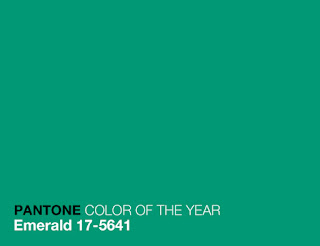
Today's post is about celebrating Pantone's Colour of the Year for 2013 - Emerald Green.
Pantone has declared their choice, "Lively. Radiant. Lush. A colour of elegance and beauty that enhances our sense of well-being, balance, and harmony."
That is a tall order for one colour! Fortunately, its rich hue, its association with royalty, and the fact that it looks good on everything from dinner rings and designer handbags, to throw cushions and vintage furniture are all evidence in support of Pantone's claim.
I must admit - prior to the last year or so, this colour kind of intimidated me. It seemed a little too bold for my own personal taste, as my preferences have always been with what I would call "safe" colours (thus, the not one, but FOUR grey cardigans in my closet). However, a few months ago, I stumbled across this gorgeous "malachite" necklace from Stella & Dot:
I LOVE it! And ever since I received that gentle push in the fashion forward direction, emerald green has been popping up everywhere (or perhaps it's been there all along and I am only now noticing it?) Anyway, last week, I may or may not have (let's go with "may have") purchased this super-sweet blouse from Anthropologie.
And, we all know that a girl can dream, right? So why not "dream in green?" I love, love, love this emerald green bag from Marc Jacobs . It is high up on my "covet" list. Keep on dreaming, Kerry!
We can always trust the design gurus at Marimekko to be on trend in delivering the boldest, richest hues of the season. I have always loved this classic pattern, and here it is in a vibrant shade of emerald.
And, seeing as this is a design blog, I should also share some pictures of cool living spaces - all of them injected with this lively, lush, and sophisticated colour. This first image comes courtesy of Interior Design magazine and features a "stop-dead-in-your-tracks-this-is-totally-amazing" plate installation on the wall. How cool is that? I love the sharp contrast between the jewel tone of the green, and the light and airy white backdrop.
This next image comes to us from the style mavens over at Better Homes and Gardens. I love the playful patterns, the symmetry, and the successful mix of old with new. If you ever wondered what a traditional wing-back chair would look like with contemporary upholstery in a geometric pattern, well, now you can.
Then, I stumbled upon this image. An emerald green velvet toss cushion? Swoon! I also love the bold chevron print of the drapery panel and the way this colour commands such a preppy presence against the neutral tones of the sofa, side table, and table lamp. Beautiful!
Finally, this eclectic mix of a vintage wood table, when paired with contemporary white "branch" chairs (love!) and the painted metal chairs (industrial meets regal - who'd have thought it would work?) adds just the perfect dose of whimsy. And the DIY centrepiece? Super cute!
Wow! I love this colour! Looking outside my window at the moment, and seeing the world covered in a blanket of white (very pretty in its own right), I am even more inspired to inject a few bold "pops" of colour into some upcoming projects.
Have a wonderful weekend,
Kerry


No comments:
Post a Comment